• Graphic Design for Business
  • About Oxygin Design
  • Clients
  • Contact
Oxygin Design - Brand Creation - West Sussex, Bognor

Oxygin Design. Bringing ideas to life!

  • Graphic Design for Business
  • About Oxygin Design
  • Clients
  • Contact

6 Characteristics of the Successful Designer!

1. THICK SKIN

You need to have thick skin if you’re going to be a successful designer. If you don’t have it, that’s okay. It’s something that can be developed. Criticism helps me grow as a designer. What I mean by this is, if someone (be it a client, another designer, or someone else) criticises your work, you’ll be much better off if you learn to handle it and take the positives from the criticism (as opposed to putting up your guard and claiming that they “just don’t get it”). But how do you develop thick skin?

The successful designer needs to be able to separate themselves from their work - this will lessen the impact of criticism. Clients won’t always be happy with the first draft – it doesn’t matter if you stayed up all night, sketched it out in your own blood and incorporated 15 different sub-meanings. Sometimes a client will tell you they don’t like a design, and that’s when you need to be able to separate yourself from your work, put on your thick skin, and forge ahead. People aren’t criticising to tell you you’re a worthless hack – they’re expressing an opinion about a medium that is largely subjective. In fact - they might be right, and they have fresh eyes for the design you spent 8 hours straight on. So don’t take offence, apply it if it’s worthwhile, and continue working on the project. It will probably turn out better than the first draft!

2. BRUTAL SELF-HONESTY

If you want to consistently put out quality work and progress as a designer, you need to be brutally honest with yourself. People have an inherent ability to justify their decisions don’t fall into this trap. At repeated points throughout the design process, ask yourself questions. Hard questions. Is this the best I can do for this project? Is this actually meeting the needs of the client, or am I just telling myself this because I’m frustrated? Is Gotham the best typeface for this client, or am I just being lazy and not pushing the boundaries?

As well, ask yourself brutally tough questions about your skills & your career progression. Am I actually the CSS Guru I tell myself I am? Or am I coasting by on what I already know? When I tell people I’m focusing solely on print design because I find it more rewarding, is that actually true? Or am I scared to branch out?

These are just examples – the depth and scope of the questions will always vary – but brutally self-honest questions like these pave the path to understanding yourself better. When you understand yourself better, you’re one step closer to becoming a successful designer.

3. LOGICAL THINKING

Much has been made of thinking logically, approaching each project with the end user in mind, designing a logo that is versatile. Thinking logically is a huge gap between average designers and great designers. For example, a logo will be used at various sizes from large to small. It would be illogical to design a raster-based logo in Photoshop, because raster-based images cannot be upsized without a loss of quality. Thus, use a vector-based program to make your logos, like Adobe Illustrator.

Thinking logically leads to solid design and career decisions - and it is a stepping stone to a successful design career.

4. GREAT COMMUNICATION

Great communication plays a huge role in the success of your career as a designer. To put it simply, you need to be able to speak plainly about your design choices - why you chose them, and why they work. If you make your design decisions logically, you will be able to communicate why they work to your client. If you’re brutally self-honest during the design process, you will be confident about your decisions - which will help when convincing your client that your design choice is the right one for their business.

To be a great communicator, you have to use words that mean something. Sounds obvious, I know, but you’d be surprised. Most designers “just know” when their design “works”. Being able to articulate why it works is part of what separates good designers from great. For example, say you chose Garamond as the primary typeface for a client’s logo design. Did you choose it because “it looks cool”? Or did you choose it because the client wants to portray her business as traditional/elegant, and will be publishing a variety of print pieces that need to have high legibility as well?

Finally, great communication can be the tipping point in you landing a client and your competitor landing that client. Put yourself in the shoes of your potential client: would you rather put your hard-earned money in the hands of a designer who promises that your logo design will “look totally great”, or in the hands of a designer who promises your logo will “reflect the image you want for your business”?

5. STRONG WORK ETHIC

So, by now, you’re a Creative Suite whiz who knows their design rules & design history. You’re a good, if not great, communicator who makes design decisions honestly & logically. You can take criticism and apply it. So you’re pretty much destined to be the next Sagmeister, right?

Nope. Not if you get up at noon, get in a quick round of Call of Duty, troll YouTube for a while, finally answer a client email at 4pm and then start to make your dinner. This is an extreme example, of course, but the point is the same: if you want to be successful at what you do, you need to work hard at it. Really hard. Ridiculously hard. Seriously, though, if you want to be a successful designer, you need to put in the time. And be brutally honest with yourself again - when you decide to pack it in at 3pm because you “worked like crazy” all day, did you actually work like crazy? Or are you just justifying your reasoning for quitting an hour and a half early?

I’m not saying you have to work 12 hour days every day. But be disciplined. Stick to work during working hours. If you’re a freelancer in a slow period, perhaps try building up some passive income. Or maybe it’s time to learn a new skill. Regardless of the specifics, it boils down to this: the harder you work, the better chance you have at being a successful designer.

6. CONFIDENCE

If you are lacking in confidence, your clients will lack confidence in you. Simple but true - clients can see a lack of confidence like that kid could see dead people in The 6th Sense. The answer to this? Don’t try to fake confidence. Build confidence. Build confidence by asking for criticism (while having thick skin!), thinking logically about your design decisions, being brutally honest with yourself about your design decisions, working really hard, and developing great communication skills.

If you do all these things, you will be confident. Your clients will notice, and they will tell their clients and their friends. Then you will woo them with your confidence (not cockiness though!). And you, my friend, will be a successful designer.

I found this blog a while ago and have to share it with anyone who reads my site as it is so true. Being freelance is tough but definitely worth it.

Many thanks to Jeff Archibald : https://paper-leaf.com/blog/2009/09/6-characteristics-of-the-successful-designer/
branding-2019-social-media2.png
tags: graphic designer, chichester designer, freelance designer chichester, how to be a successful designer
categories: Graphic Design
Wednesday 05.22.19
Posted by Ginny Salmon
 

6 Brands that use Illustration to Stand Out Online

For so many brands with an online presence, it can be easy to overlook the importance of imagery when it comes to developing their voices and identities.

Too often companies opt for generic corporate photography and stock imagery, and while these images have a valuable place in some industries, they can make your brand look disingenuous, indifferent or just plain boring if used too frequently and without much consideration.

It’s equally important not to rely solely on copy as a means of conveying a message. After all, users only read an average of 20% of any given webpage. Therefore, the images used on such a page will need to do most of the talking.

The internet is now such a busy and competitive space that it has become crucial for brands to make an impactful and memorable impression on potential customers. Incorporating illustration into your branding is one way to do that.

In this article, we’ll delve into some of the brands distinguishing themselves from the competition with illustrative content and explore why this imagery works so well.

1. Etsy

Ecommerce brand Etsy uses brand colours throughout its illustrative content to tie in with its logo. The rustic tones of orange reflect the handmade nature of the products made by independent artists and businesses listed on its website.

Screenshot+2019-02-28+at+14.31.27.jpg

I was captivated by Etsy’s quirky illustrative style, which incorporates a combination of different shapes, characters and objects to imitate the unique qualities of the items for sale on the platform. The overall effect is contemplative and friendly, emphasising to the user that Etsy is a safe and trusted place for creatives to sell their work online.
On the brand’s social channels, posts are reserved for showcasing stand-out products and sellers rather than illustrative content.

2. Slack

Team collaboration tool Slack uses bold colour without restraint, resulting in  illustrative content that’s engaging and memorable from the moment you land on its homepage.

Screenshot+2019-02-28+at+14.34.28.jpg

I particularly like the inclusion of characters within a scene, and I find myself taking more time to explore the images and their relation to the copy beside them. An occasional angular layout adds movement to the images and, in turn, emphasises the dynamic environment in which the software was designed to be used.

A slightly different illustrative style has been adopted on Slack’s social channels, but the colouring and use of the company logo ties it back to the overall brand identity nicely.

3. Mailchimp

You won’t miss Mailchimp‘s illustrations in a hurry; partly due to the incredibly bright shade of yellow they have adopted, and partly due to the quirky, hand-drawn nature of the images themselves.

The energetic, sketchy style encapsulates an impression of speed, which goes hand-in-hand with the brand’s mission to make email marketing as quick and easy as possible for its subscribers.

It is clear to see that Mailchimp have made a huge effort to carry this styling through to their other marketing channels, which gives the brand a consistent voice.

Screenshot+2019-02-28+at+14.37.05.jpg

4. Asana

Work management platform Asana includes an illustrated ‘tour’ feature, as well as a number of spot illustrations and animations elsewhere on its website. Predominantly constructed using simple shapes and a limited palette of a few brand colours, these illustrations are easy to understand and help to represent the basics of each topic.

The simplicity of the imagery here reinforces that the platform itself is as simple to use as it is to learn about.

While Asana uses a softer approach with the illustrations on its website, images that are posted on its social channels are made to stand out with the addition of black outlining. This serves to differentiate the style used on each of Asana’s channels without altering any other part of their design or character templates.

Screenshot+2019-02-28+at+14.38.44.jpg

5. Salesforce

If you’re looking for full-screen illustration with an impact, look no further than the Salesforce website. Each of their featured products comes with its own unique landscape background, complete with Salesforce mascots participating in activities related to that topic.

The bright colours and sense of depth make the website especially memorable, and the placement of information has been well thought-out so as to strike a balance between these elements.

Screenshot+2019-02-28+at+14.39.57.jpg

The product pages are designed as entry points leading to further, more complex information, which explains the dominance of imagery over copy at this point in the customer journey. Had this design been carried throughout the entire website, it would be overwhelming, particularly for users with accessibility needs.

On Salesforce’s social channels, illustrated landscapes are ever-present – if less  focal – leaving room for other visual elements such as copy, CTAs and photography.

6. Headspace

I really enjoy the styling of Headspace‘s illustrations, particularly the inclusion of little characters and the simple orange and blue colour scheme. The focus on the characters’ wide smiles combined with plenty of rounded shapes gives the brand the friendly and encouraging feel aligned with their positive tone of voice.

Screenshot+2019-02-28+at+14.41.14.jpg

I particularly like the way that each character has its own individual appearance, reinforcing the idea that Headspace is an app that can be used by anyone and everyone to achieve a sense of mindfulness.

I was also impressed with the consistency of style across their social channels, mixed with some photographic content to back up more tangible topics.

Blog courtesy of https://econsultancy.com/brands-illustration-stand-out-creative-design/

tags: illustration design, illustration, graphic designer
categories: Illustration
Thursday 02.28.19
Posted by Ginny Salmon
 

How to Spot a cheap Logo Design

1 – It’s Overly Complex

2 – It Lacks Versatility

3 – It’s Derivative

4 – It’s Forgettable

5 – It’s the ‘Wrong’ Colour

6 – It’s Brand-Inappropriate

  • Balance

  • Proximity

  • Alignment

  • Repetition

  • Contrast

  • Space

    Logo design that meets all of the six design principles isn’t a luxury, it’s a necessity for anyone trying to tell a story.

    It doesn’t take an experienced graphic designer to spot a cheap logo design - and the average consumer is savvier than you think.

    Keep in mind that your logo design represents your entire brand; it’s more than just a little image for your website or business cards.

    This symbol will be used to make a brand judgement quicker than you realise with images being processed 60,000 times faster than text.

    Many of the principles of graphic design are closely tied to the science of behavioural psychology.

    Even if your average consumer can’t communicate why your logo makes them feel embarrassed, disgusted, or confused, they’ll have a reaction.

    You probably know what you like (and dislike) when it comes to logos and graphics.

    Whether you’re considering rebranding or purchasing your first professional logo, here are some ways to evaluate how to spot a budget logo design.


1 - It’s Overly Complex

Just for one second, consider some of the world’s most recognisable logos. Did you just think of the McDonald’s “M”? the Nike swoosh? Or the Apple with a bite taken? All of these logos are really simple. Many famous logos are even revised to become even simpler.

What exactly spells out the difference between complexity and simplicity in logo design.
A confusing logo can be caused by the use of too many colours, detailed images, intricate fonts, or excessive superfluous elements. A logo with extraordinarily complex design doesn’t make your brand look high-class or fancy. It means your graphic designer didn’t understand the value of simplicity.

2 - It Lacks Versatility

”One of the most tragic and familiar hallmarks of truly cheap logo design is a lack of versatility.”
In today’s marketing culture, the ability for a logo to scale and appear attractive across multiple mediums is crucial.
Versatility in logo design means usage on smartphone, tablet and computer screens; print advertising and even billboards.

Adaptability is a critical filter to consider when creating a logo design, and far too many small business owners aren’t aware of the right limitations.

I recommend asking the following questions before you make a final selection, to avoid the need for total rebranding in the future:

• Can this logo be printed in a single colour? Just black and white?
• Is this logo’s message retained if it’s shrunk down to no more than 2 cm in either direction?
• Would the logo look too bland or boring if it were blown up to the size of a billboard? 

It would amaze you how many design concepts have to be discarded when you apply the filter of flexibility.
Exceptional logo design is usually complex enough to engage on a gigantic scale, and sufficiently simple to tell a story when it’s quite small.

3 - It’s Derivative

There are major trends in the fields of graphic design and branding, fuelled primarily by consumer demand.

All it takes is a visit to the facetious hipster logo generator to recognise a significant, recent pattern in how “cool” companies are branding themselves.

Should you ignore the latest graphic design trends, or avoid incorporating fleeting factors like Pantone’s colour of the year into your branding? - Almost certainly.

The world’s most beautiful and effective logos are almost timeless in their design. If your mission is to communicate your brand’s hipness factor, there are more efficient ways to do this than derivative design.

Take the example below of the BMW logo. Their original logo designed in 1916 hasn’t changed too much, only being occasionally refreshed stylistically to keep things fresh.

BMW-Logo-Design-History.png

4 - It’s Forgettable

The best logo designs in the world communicate an entire brand in one single glance.
Lego’s logo (pictured below) relays the idea of fun and childlike playfulness.
Mercedes Benz’s branding spells out luxury in nothing more than three lines and a circle.
The greatest logos have a story to tell, which is why they’re generally unique.

Legendary logo design expert Paul Rand once stated that the only hard and fast rules for logo design were to be:

Distinctive, memorable, and clear.

While it’s extraordinarily difficult to define memorable design, it’s certain to have a few factors. It’s likely to be slightly surprising, without jarring the viewer. It’s addictive and appealing to look at.
Ultimately, it’s going to be both original and familiar enough that it leaves the viewer wishing it was their idea.
Your brand has something valid and original to offer the world.

If your logo design looks like every other small businesses’ branding, you’re not communicating your unique value proposition.

5 - It’s the ‘Wrong’ Colour

Colours can be misrepresentative or ‘wrong’, even if they’re not “ugly” in their own right.

Professional logo design always considers colour theory, which is the science of how humans perceive various shades.

• Red: Importance, danger, anger and passion
• Orange: Energy, health, and vitality
• Yellow: Energy, hope, and cowardice
• Green: Abundance, growth, money, and new beginnings
• Blue: Responsibility, calmness, sadness
• Purple: Creativity, imagination, and royalty
• Black: Power, elegance, mystery, and formality
• White: Purity and cleanliness

Your logo’s primary and secondary colours should reflect who you are as an organisation.

A financial planning firm, for example, could come across as irresponsible with a yellow logo, while a decadent purple shade may not fit a health food brand.

6 - It’s Brand-Inappropriate

While colour theory is one of the most important ways logo designs tell stories, it’s far from the only factor.
Many experts believe there are approximately six principles of graphic design that affect how a design is perceived by a consumer.

These principles are:

  • Balance

  • Proximity

  • Alignment

  • Repetition

  • Contrast

  • Space 

All of the fundamental principles of graphic design work together, with the help of colour and typography, to communicate a message. If one factor is significantly off or ignored, your message will be obscured by poor design. And more likely than not, the result will be upsetting, confusing, or just plain cheap company logos. A poorly designed logo with insufficient contrast can be difficult for individuals with visual disorders to navigate. An imbalanced logo design upsets the natural human attraction to patterns. Proximity and alignment work to direct the viewers’ eyes appropriately.

Logo design that meets all of the six design principles isn’t a luxury, it’s a necessity for anyone trying to tell a story.

Rebranding is difficult. It’s challenging, expensive, and doesn’t always work. Even on massive budgets, there are some very high-profile cases of logo fails and rebranding disasters.

When purchasing a logo, your goal should never be to settle for the most affordable logo design packages you can get or to select something that’s going to need to be quickly replaced.

Knowing the reasons why some cheap logo design just looks inferior is a critical tool for marketing success.

 If you are looking for professional logo design on a budget, be sure to check our affordable logo design services go to : The Logo Design Page on this website.

If you wish to discuss how we can develop your brand or provide graphic design for your product or business, email us at: design@oxygin.co.uk


Blog post courtesy of : https://inkbotdesign.com/spot-cheap-logo-design/

Follow our Instagram Account to see just s few of our Logo Designs.

Hopefully getting back to normal soon! #businessbranding #logocreation #logorefresh #logodesign #brandingidentity #brandingchichester #brandingbognor #bognorregis #bognorregislogodesign #redesignlogo
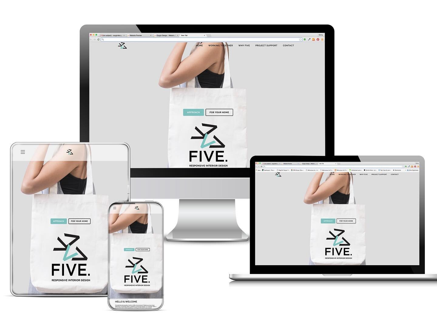
Great to announce the brand new website for 'Five. Responsive Interiors' - In these times your office space or home office may need a complete rethink! Contact Helen for on the new site for more details. 👩‍💻 https://fivedesign.uk/

#websitecrea
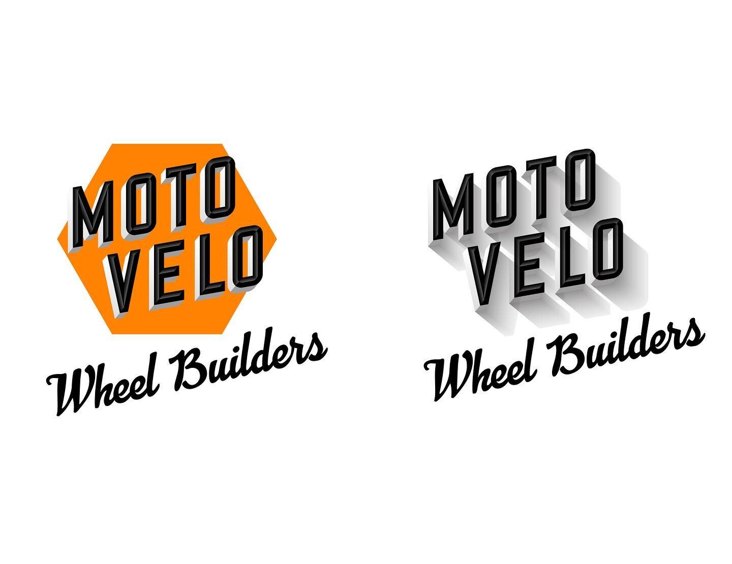
A new stylish logo Identity for a local wheel builders. The brief was to keep the styling vintage. This is the result. A orange emblem which can be used for signage, digital, and print. This was created during lockdown as a new start up. Good thinkin
#thankyou #workingfromhome 🙂
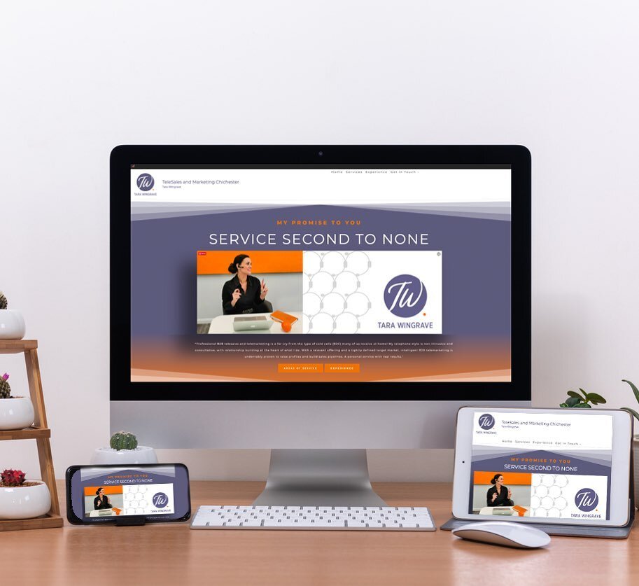
Tara Wingrave, Telesales and Marketing - Brand new website design and creation with her new brand identity and colours. 
Check out her new site with ‘WhatsApp’ chat facility! 👩🏼‍💻#chichester #telesales #websitedesign #tarawingrave
I am very lucky to share an office with #BrightServe who deal with CRM systems and do all sorts of techie stuff. They provide an amazing work space and environment to work in. We have a great meeting room and lots of coffee and tea ☕️ for new clients
For everyone who’s left present buying until the last minute or just is not sure what to get that certain someone @seacombeandco have the perfect Christmas Gift! Beautiful Gift vouchers to get your hair on track!!🎄 #giftvouchers #christmas #se
You may need other elements to go with your logo identity. For example an icon which is recognisable on it’s own as part of your brand. Or a graphic to go with your designs to tie everything together. It’s so important that everything lin
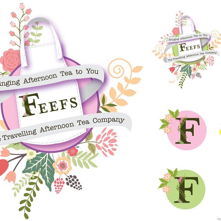
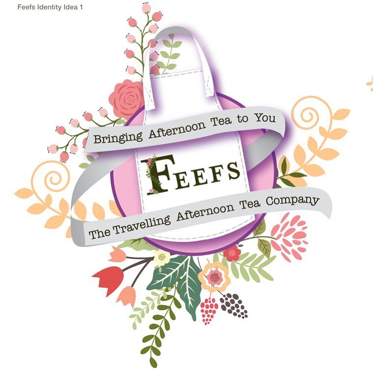
Here it is, the chosen brand new identity for ‘Feefs’ The Travelling Afternoon Tea Company. The client had had two previous designers work on the identity but was not happy with the results. It was lovely to hear that the owner was &ldquo
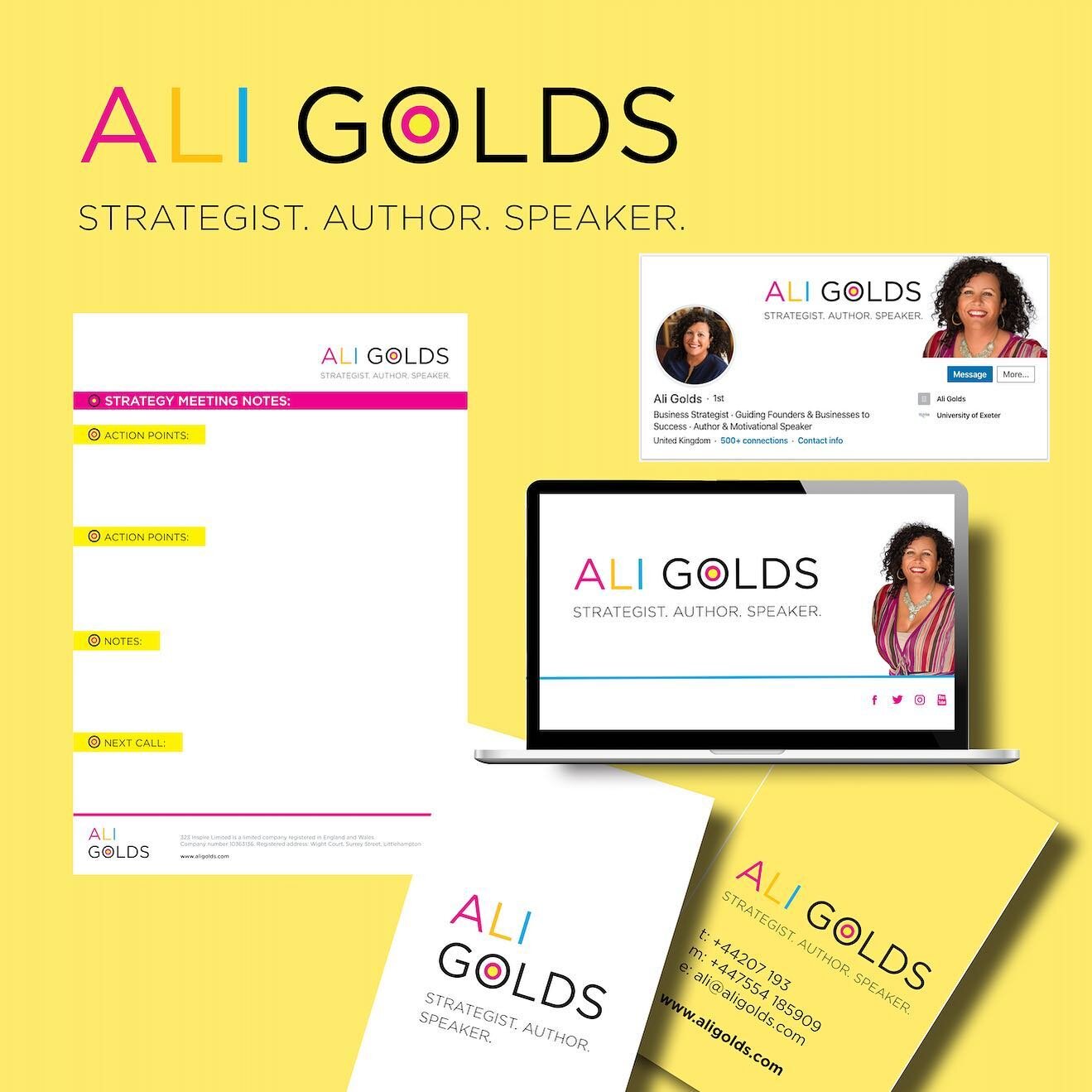
Get your digital presence all on brand! PowerPoint Presentations, Word files, LinkedIn headers, Social Banners. They can all look great together giving a real professional look. 🙌🏽 #worddocs #powerpoint #branding #brand #aligolds #graphicdesign #on
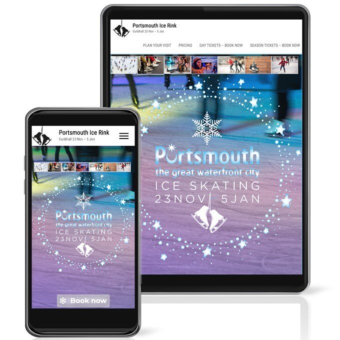
Excited to finally have finished the Portsmouth Ice Skating Website - All ready for the Winter Season ❄️ ⛄️ @portsmouth_ice_rink 
#portsmouth #portsmouthiceskating  #iceskating #wesbite #websitecreation #portsmouthicerink #icerink #websitedesign #des
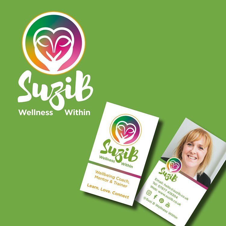
Still love this branding created for Suzi-B earlier this year. Suzi-B creates and presents some great retreats for stressed out mothers, fathers and those who would like to relax. Her latest retreat is on October the 14th @hunstonmanorhouse check out
tags: logo design sussex, logo design, logo design chichester, west sussex logo design, logo design west sussex, sussex logo design, graphic designer west sussex
categories: Logo Design
Wednesday 10.24.18
Posted by Ginny Salmon
 

Graphic Design and Why it's a Great Career

If you're thinking about becoming a graphic designer, then – there has never been a better time. The world is your oyster if you know how to visually communicate ideas that inspire, inform or engage people.

You're in demand too. The creative industries alone rake in £87.4billion each year to the UK economy. In 2015, there were 2.9million creative jobs. And the future is only looking brighter. The UK could become the leading hub for the world's creative industries within a generation, according to the CBI.

We've seen demand for graphic design courses skyrocket over the last five years, with a surge of new students joining campuses in the UK, Australia and North America.

Read on to learn why a career in graphic design could be the best decision you've ever made.

oxygin-design-blo-image.jpg


1. You'll learn skills that a robot or machine could never do
Millions of UK workers are at risk of being replaced by robots within 15 years, a study claims. It's depressing news for many, but if you learn something that machines could never do, then you'll be future-proofing your career for many decades to come.

Graphic design is creative and requires human-led intelligence and ideas to respond to trends, tastes and what has already been before. It will never be something a robot can mimic. Sure, the technology to create will continue to make our lives easier as designers, but they'll never replace us. Never.

2. You're satisfying the creative needs of Generation K
You've heard about the Millennials; now it's time to learn about Generation Z – those born between 1995 and 2002. Academic, economist and author Noreena Hertz calls them "Generation K", inspired by Katniss Everdeen of The Hunger Games. She wrote in her article for The Guardian: "Like Katniss, they feel the world they inhabit is one of perpetual struggle – dystopian, unequal and harsh."

You can't blame them really. They were born in "the shadow of economic decline, job insecurity, increasing inequality and a lack of financial optimism." It's an anxious generation.

But what's interesting about Generation K (along with the Millennials) is that they're hugely creative. They love to make things, hack things, and create something new. They're inspired by everything around them – and this is where you and your graphic design skills come into play.

3. Design and branding matters more now
Whilst we're on the subject of Katniss Everdeen and Generation K, you should know that these people don't trust brands or traditional big business. Which is why design and branding matter more than ever before.

The need to create visuals that will attract and win over this tough crowd will ensure design is treated with the respect it deserves. It will be your job as a designer to help win hearts and minds through your creativity. How exciting is that!

4. It's easier than ever before to design for yourself
Technology is cheaper and more accessible. The Internet offers a wealth of inspiration and ongoing learning. Feedback from others can be found in an instant. There has literally never been a better time to design for yourself. Heck, you can even start your own side business and sell your own greeting cards if that's what you want to do.

In fact, once you become a graphic designer, you'll find that your new-found skills will translate to many other parts of your life. You can get really creative once you have an eye for layouts, symmetry, grids and lines.

5. There's never been a better time to live and work overseas
If you're feeling adventurous and want to secure a job overseas, then graphic design is in demand everywhere. In Australia, it's a profession that gives you a good chance of qualifying for a skilled visa.

6. You live in a time when millions could see your work
If showing off is your thing, and you want to see your name (or work) in lights, then graphic design is a huge boost to the ego. Your designs could literally be seen by millions – online, on the street, in newspapers and magazines, on packaging. The world's eyes will be on your creativity. And there's something truly magical about that.

7. You'll be able to survive many twists and turns during your career
Gone are the days when you could enjoy a "job for life". Today, you'll be lucky if you can stay anywhere for more than five years. Reassuringly, graphic design gives you skills that are in demand and can apply to many different career paths. They're transferable. One minute you could be working at a design studio, the next – you're working in-house for a large brand. At time of writing this article, there are over a thousand jobs in graphic design on Monster UK.

8. You'll problem-solve every day, boosting your brain power for a longer life
According to the latest findings in Neuroscience, your brain reaches its peak performance between 16-25 years, and that's when cognitive functioning declines. Bummer. The good news is that we can train our brain to perform better. It's a muscle, after all, and therefore needs regular exercise.

Well, graphic design makes your brain very active. It forces you to problem-solve every day, which challenges you and consequently ensures you're performing at your best capacity. If you want to keep your brain strong, healthy and perhaps smarter, then graphic design can help.

Struggling with a little creative block? Try these lateral thinking brain teasers and logic games to get the creative juices flowing again.

9. In dark times, you'll be able to absorb beautiful, creative things
The world is most definitely a dark place right now. But despite this, there is always something to smile about. Graphic design gives us the daily opportunity to embrace our surroundings, think creatively and absorb the most beautiful things life has to offer.

It's a wonderful career – one that you could argue doesn't even feel like a job. From thinking up colour palettes and solving the next big problem... from choosing the perfect font to happily agonising over the best-weighted paper... graphic design is a wonderful thing.

10. You'll learn the ropes to go freelance if you want to
Apart from refining your typography skills and understanding how to translate a sentiment into an appealing brochure, a career in graphic design will most likely teach you how to be your own boss.

Many designers learn the ropes of entrepreneurship when they work for a studio or agency, particularly if the company is small and they get to see first-hand the daily struggles and challenges.

You might find one day that you fancy a little more independence by going freelance. The benefits of freelancing can be endless. It won't be easy, that's for sure. But isn't it reassuring to know that if the robots haven't taken over in future, you can look forward to a different path – one of many routes open to you, now that you're a graphic designer? What a great time to be creative.

Blog with thanks to :

https://www.creativeboom.com/tips/10-great-reasons-why-its-an-awesome-time-to-study-graphic-design/

categories: Graphic Design
Wednesday 07.04.18
Posted by Ginny Salmon
 
Newer / Older